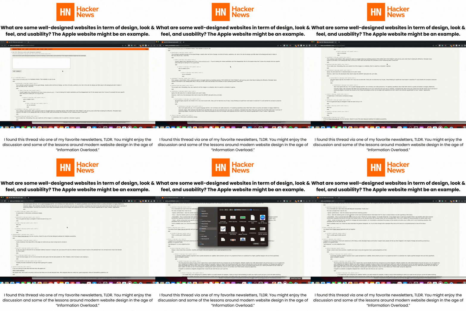
I recently read a great thread from the Y-combinator community regarding changing requirements from users as it relates to website design:

Modern marketers (myself included) sometimes struggle with focusing purely on the latest/coolest features as it relates to aesthetic design.
Painpoints regarding accessing information, unique to the specific needs of very niche users (e.g. Toyota Rav4 restoration enthusiasts), becomes about less focus on pushing messages to users, and allowing them to be pulled in through relevant content organized in a manner which contextualizes their painpoints.
Empathy with websites comes in the form of remembering:
its about them, not you.
Website updates should include a narrow focus on your audience, even if its just you.
As part of my focus on restoring my RV, Harriet, I'm come into contact with Rock Auto.

Rock Auto is a very simple, text and image based website which I'll continue to use based on their database of OEM auto parts specific to my discontinued 1970's era RV.
With an aesthetic reminiscent of Craigslist, I was referred to the site by a mobile mechanic.
The cost to acquire me came in the form of a referral or recommendation from one of their establish customers.
I can't think of receiving any marketing messages at all outside of an email sign up offer... which came only after I was already aware of the site.

I can't think of receiving any marketing messages either, which also confuses my inner marketer because I've made at least 3 purchases in the past 4 months and currently have items in my cart.
And I plan on making more purchases soon:
Harriet needs some work if she's going to get the places I plan on taking her.
My favorite site from the Y-Combinator Thread? McMaster-Cann.

This is what Rock Auto should aspire to be in my opinion; the visual modules help an Auto Repair newbie like me.
Armed only with a user manual and willpower, searching and running queries becomes a matter of matching parts to photos based on the car component I'm focused on repairing.
The large visual images and tabular layout ensures I don't need to change my view within my browser (Chrome in this instance) in order to browse which sections are relevant while navigating towards my desired department.
I particularly like the sneaky, native secondary navigation on the bottom of the page.
From a User Experience design perspective, I also appreciate their less is more approach, making the best use of their available real estate to patiently guide you with relevant, standardized images which don't overload your brains cognitive capabilities.
Processing too much information is something I'm particularly sensitive to now that I'm back from Burning Man.
Let's face it:
some of the challenges associated with modern websites are the pressures we feel when overloaded with too much information.
Empathy for website users comes in the form of remembering that if their on your site, the goal is to help them as quickly as possible so they can move on with their lives, not to stress them out with a constant barrage of non-relevant information.
As someone establishing a personal conduct system to guide my own relationship with technology, I'm encouraged when I see brands and organizations embodying the underlying principles of #CalmTechnology.
From a personal perspective, the broad topic of calm technology, personal relationships with technology, and managing cognitive overload, I'm also reminded of educational requirements I've established for myself this year.

While I didn't pass the first version of my SAFe 6.0 Agile Scrum Master certification, I'm encouraged by my first attempt grade.
Faithful to a recognition that I thrive through theory and practice, I'm employing aspects of the training into my own personal system, particularly as it relates to the Second Brain concept I've been exploring in my free time.
I'm currently exploring several Enterprise Architecture frameworks including LeSS and TOGAF. I appreciate the Open Source nature of both of these tools as a I seek to level up my System Admin game.
I wonder how these frameworks will impact future versions of my favorite website projects?